Client
TheBoardroom Africa (TBrA)
sector
Leadership & Governance Advisory
country
Mauritius
Creative Director
Adesanmi Ayomide
Year
2026
Scope of work
Brand Identity Refresh · Anniversary Lockup · Social Design System · Email Signature
A logo refresh and 10th-anniversary identity for Africa's leading board-leadership platform
Overview
TheBoardroom Africa (TBrA) connects, develops, and places diverse executive leaders on boards and in the C-suite across Africa and globally. Heading into its 10th year, the organization needed its visual identity to catch up to its scale — sharp enough to sit alongside global governance and leadership brands and flexible enough to carry a milestone campaign, a growing sub-brand architecture, and a constant stream of LinkedIn content.
Scope: Primary logo refresh, 10th-anniversary lockup, LinkedIn poster system, and email signature design.
The Challenge
- The existing logo’s Venus symbol no longer represented the brand — TBrA works with diverse leadership, not a female-only audience, and the mark needed to reflect that.
- The identity had to read as bold, modern, and authoritative — benchmarked against brands like Airbnb, Slack, and Meta, not typical African-nonprofit visual tropes.
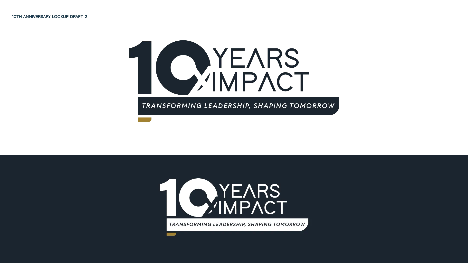
- 2026 needed its own moment — a 10th-anniversary system built around the theme “10 Years. 10x Impact” and the tagline “Transforming Leadership, Shaping Tomorrow” — without overshadowing or clashing with the core logo.
- The new system had to flex across sub-brands (TheBoardroom Search, TheBoardroom Initiative, TheBoardroom Executive Education) and stay cohesive across every day-to-day touchpoint: LinkedIn posts, appointment announcements, event promotion, and email signatures.
- Explicit constraints from the brief: no literal African motifs, no feminine clichés, no generic corporate tropes, no heavy gradients, no dramatic departure from what TBrA is already recognized for.
The Approach
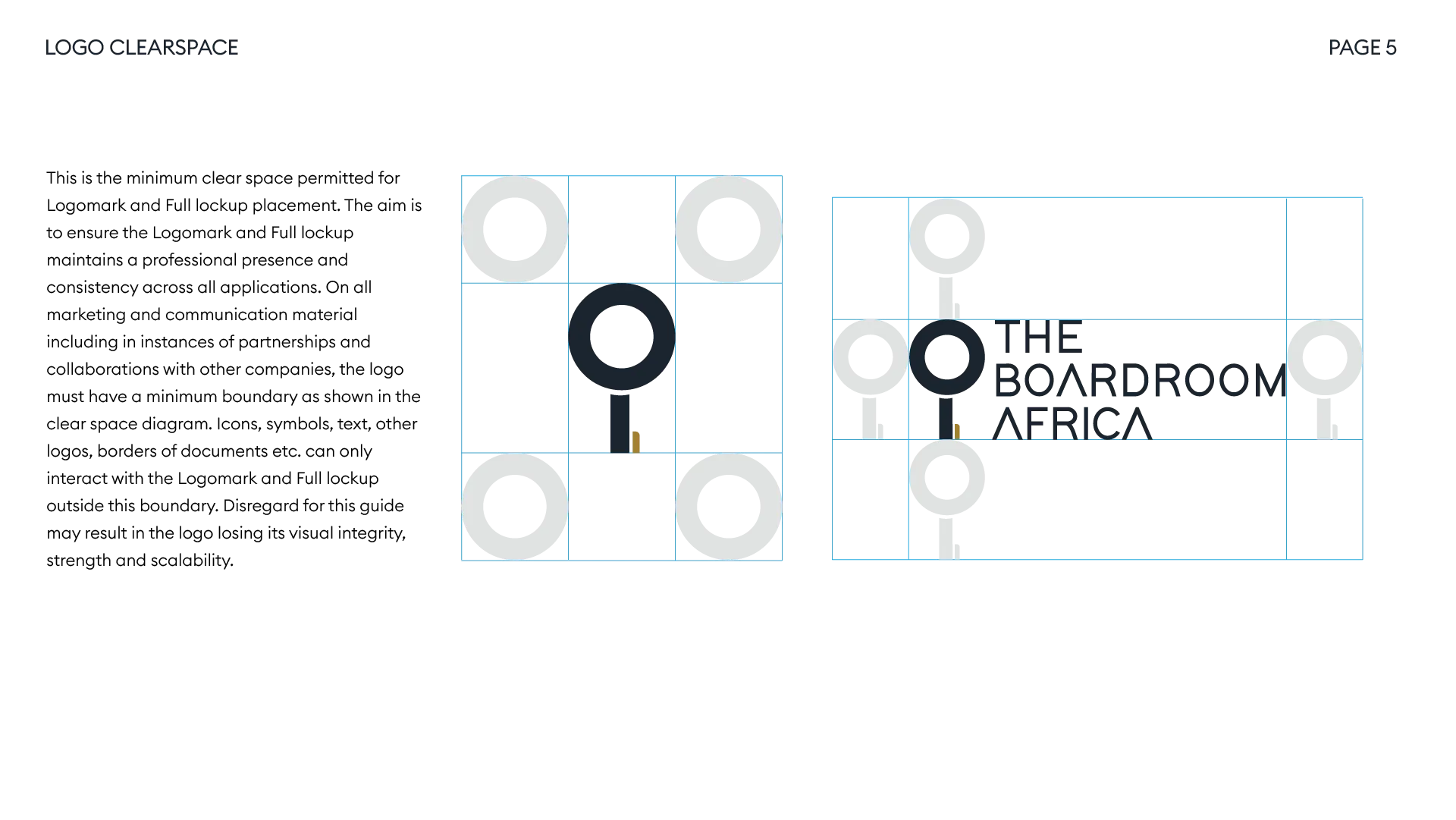
- Retired the Venus symbol and rebuilt the mark around a key/keyhole motif — signaling access, unlocking opportunity, and governance — instead of a gendered or literal symbol.
- Modernized the wordmark typography for cleaner geometry and better balance at both large and small sizes.
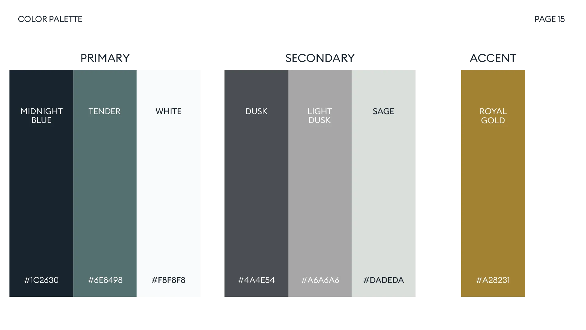
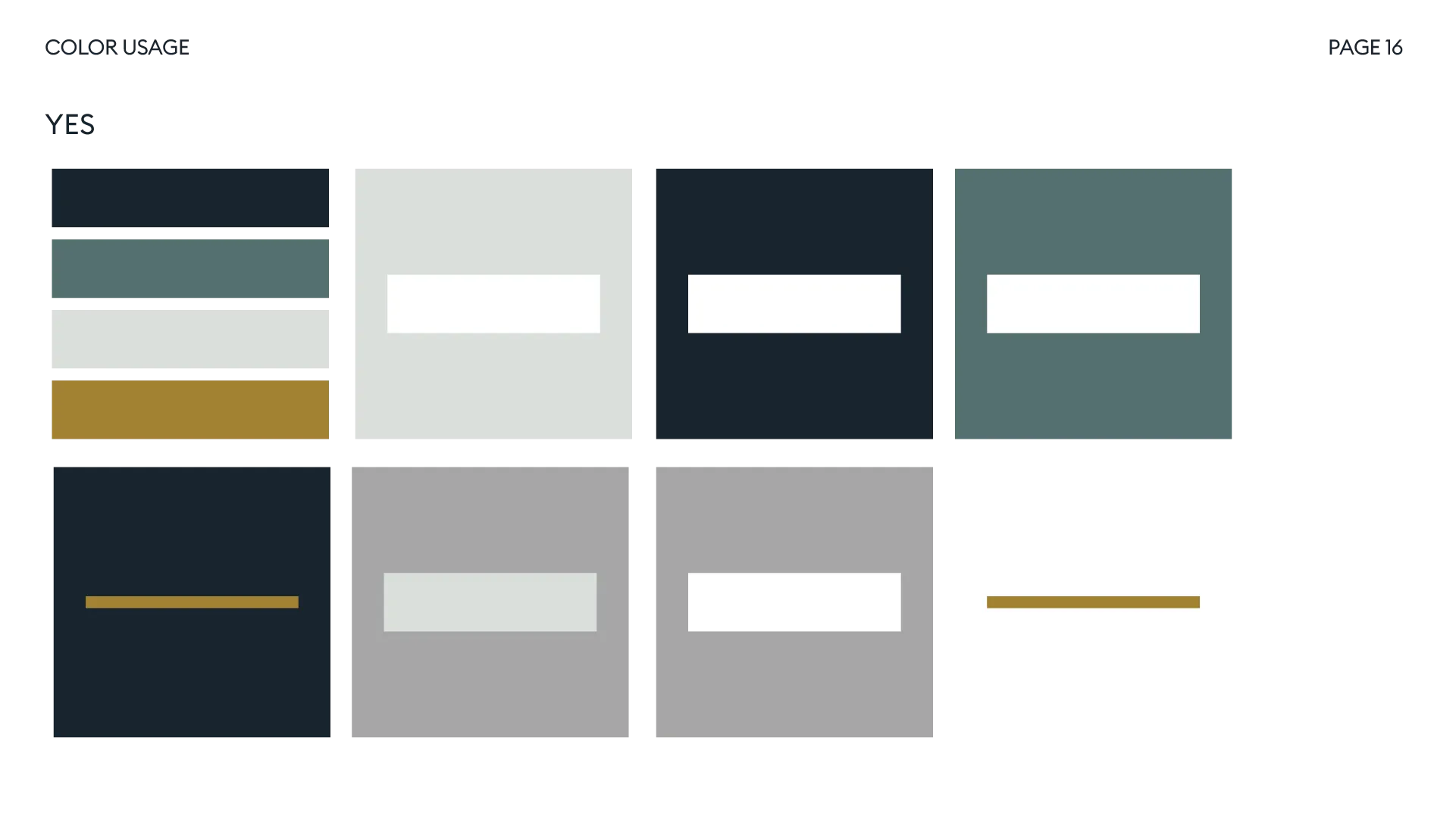
- Anchored the palette to a confident navy (
#1B252F) and a refined gold (#A2822F) — sophisticated and restrained rather than decorative. - Designed the anniversary mark as a “10” built from the key motif and a circular badge, so it visually locks into the primary logo rather than competing with it.
- Avoided anniversary clichés — no balloons, confetti, or fireworks — using photography collages, milestone typography, and the gold accent instead to keep the celebration premium.
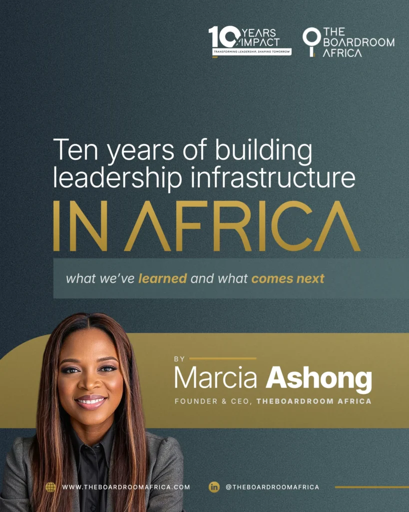
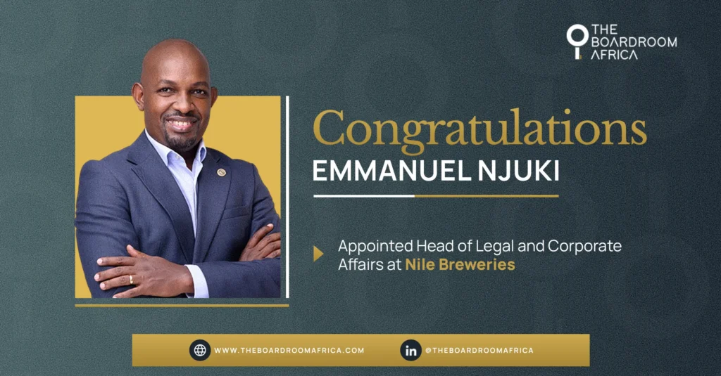
- Built a repeatable LinkedIn template system: consistent logo lockup, name/title callouts, and info hierarchy, adaptable to appointments, event promos, thought-leadership carousels, and community/testimonial posts.
- Delivered the lockup in every format the brief required — horizontal, stacked, monochrome, full-color, and a simplified small-use mark — so it works from a favicon to a step-and-repeat banner.
The Solution
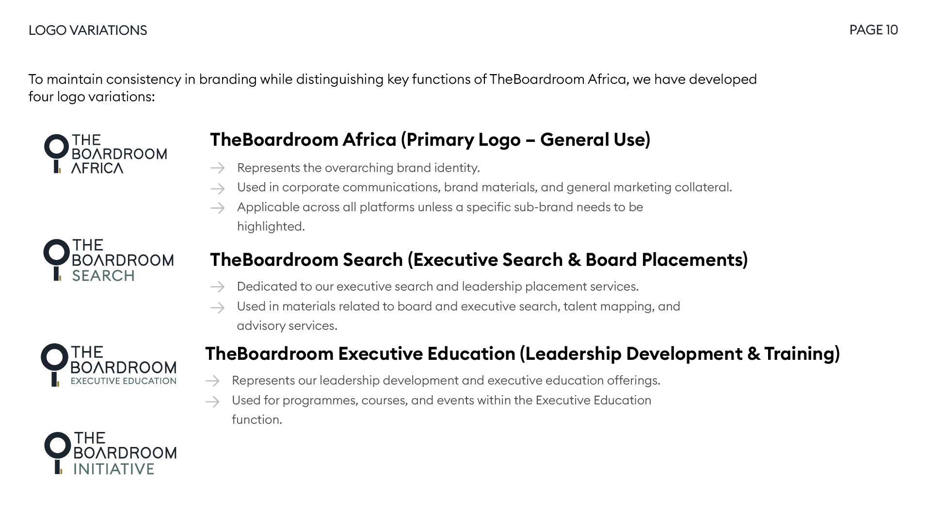
- Refreshed primary logo — Wordmark + key/keyhole mark, in horizontal and stacked configurations, with monochrome and full-color versions.
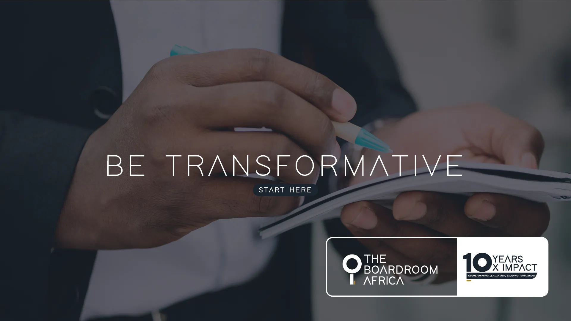
- 10th-anniversary lockup — “10 Years. 10x Impact” badge mark, paired with the “Transforming Leadership, Shaping Tomorrow” tagline, integrated into the primary logo at varying levels of prominence depending on the application.
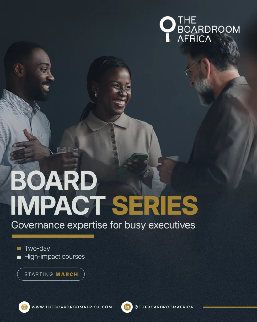
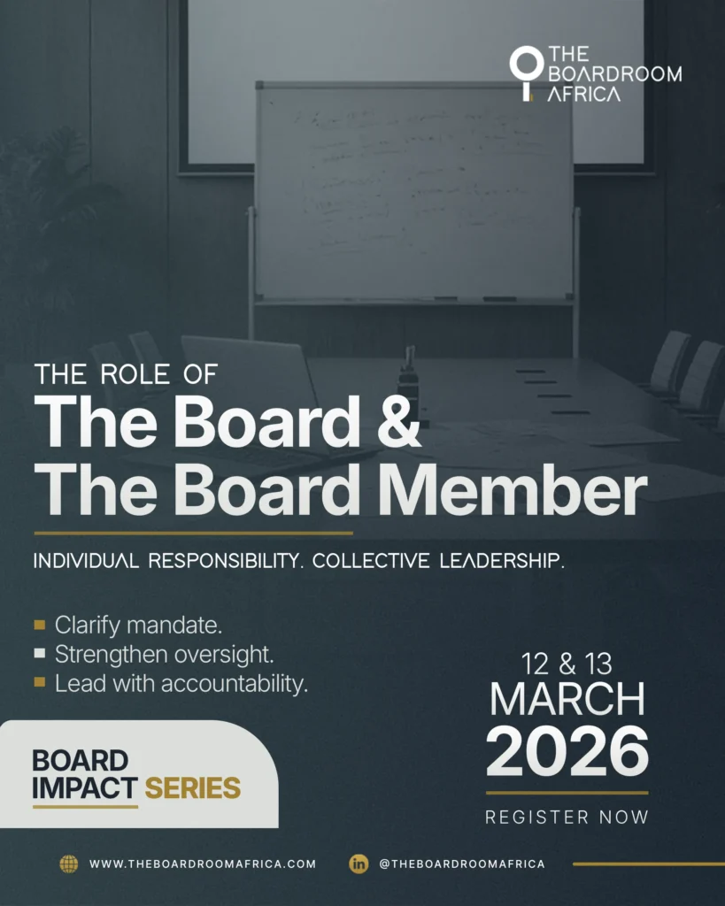
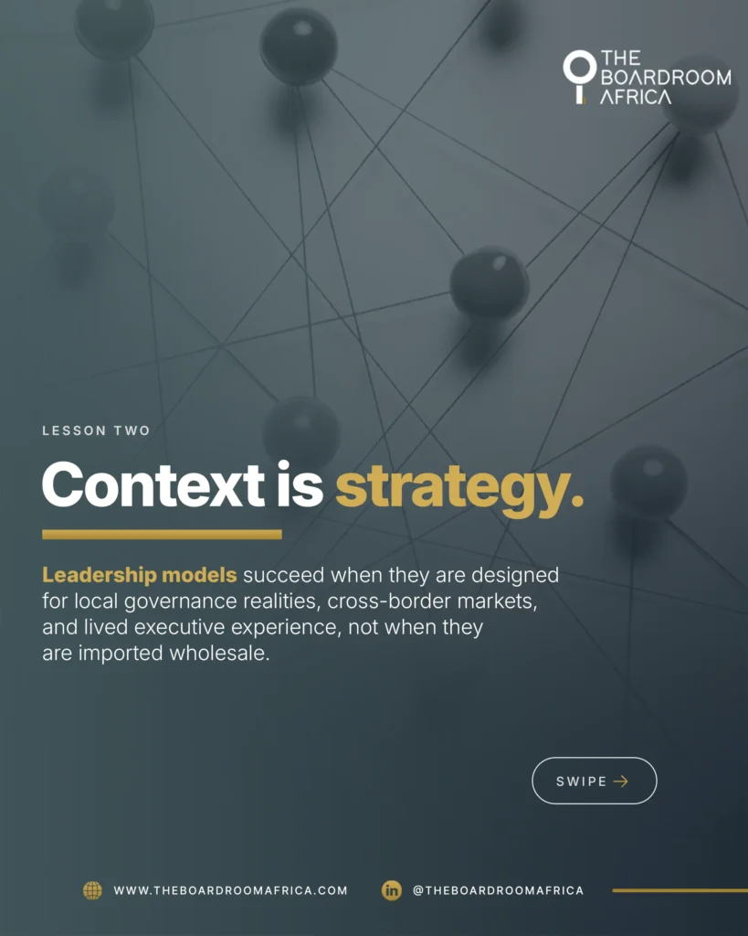
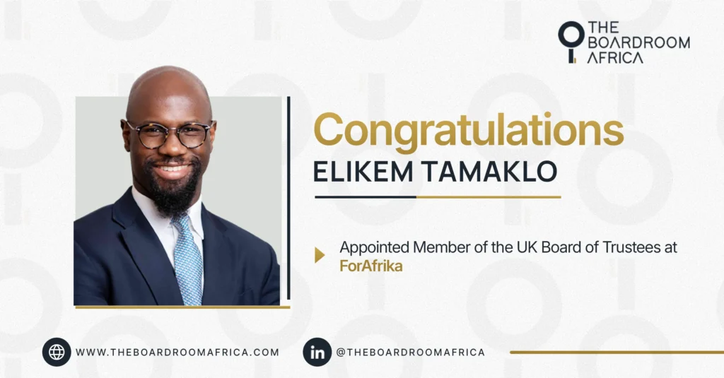
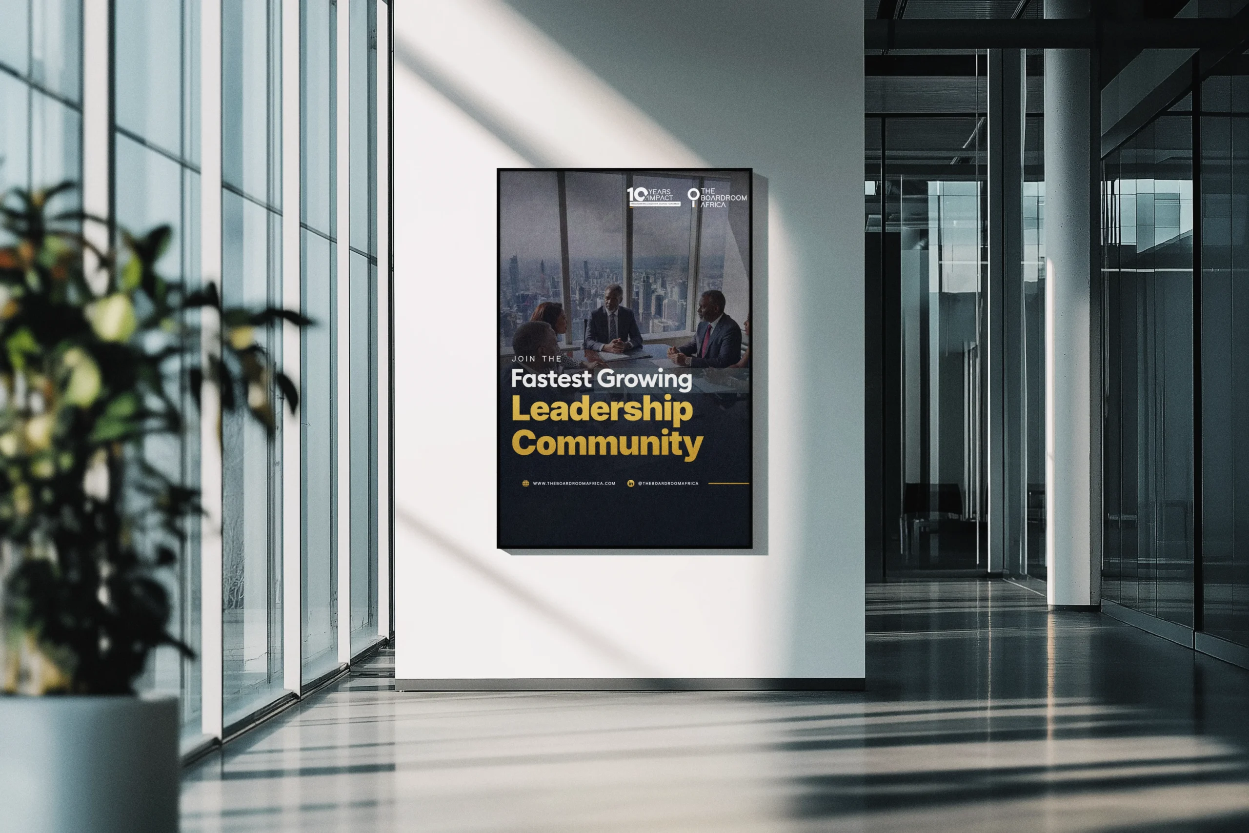
- LinkedIn design system — Recurring templates for appointment/congratulations posts, event promos (Board Impact Series), thought-leadership carousel slides, membership/community campaigns, and milestone content.
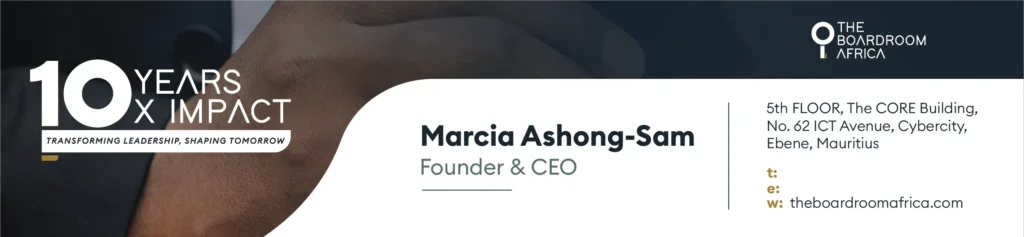
- Email signature template — Branded signature carrying the anniversary lockup, staff name/title, and office contact details, built for company-wide rollout.
- Usage flexibility — A system designed to extend cleanly to TBrA’s sub-brands (Search, Initiative, Executive Education) without fragmenting the parent identity.
The Outcome
A refreshed identity that finally matches TheBoardroom Africa’s stature — dropping a symbol that no longer fit, replacing it with a mark rooted in the brand’s real purpose (unlocking access to leadership), and pairing it with a 10th-anniversary system built to carry a milestone year across every channel without losing consistency.
Client
TheBoardroom Africa (TBrA)
sector
Leadership & Governance Advisory
country
Mauritius
Creative Director
Adesanmi Ayomide
Year
2026
Scope of work
Brand Identity Refresh · Anniversary Lockup · Social Design System · Email Signature
A logo refresh and 10th-anniversary identity for Africa's leading board-leadership platform
Overview
TheBoardroom Africa (TBrA) connects, develops, and places diverse executive leaders on boards and in the C-suite across Africa and globally. Heading into its 10th year, the organization needed its visual identity to catch up to its scale — sharp enough to sit alongside global governance and leadership brands and flexible enough to carry a milestone campaign, a growing sub-brand architecture, and a constant stream of LinkedIn content.
Scope: Primary logo refresh, 10th-anniversary lockup, LinkedIn poster system, and email signature design.
The Challenge
- The existing logo’s Venus symbol no longer represented the brand — TBrA works with diverse leadership, not a female-only audience, and the mark needed to reflect that.
- The identity had to read as bold, modern, and authoritative — benchmarked against brands like Airbnb, Slack, and Meta, not typical African-nonprofit visual tropes.
- 2026 needed its own moment — a 10th-anniversary system built around the theme “10 Years. 10x Impact” and the tagline “Transforming Leadership, Shaping Tomorrow” — without overshadowing or clashing with the core logo.
- The new system had to flex across sub-brands (TheBoardroom Search, TheBoardroom Initiative, TheBoardroom Executive Education) and stay cohesive across every day-to-day touchpoint: LinkedIn posts, appointment announcements, event promotion, and email signatures.
- Explicit constraints from the brief: no literal African motifs, no feminine clichés, no generic corporate tropes, no heavy gradients, no dramatic departure from what TBrA is already recognized for.
The Approach
- Retired the Venus symbol and rebuilt the mark around a key/keyhole motif — signaling access, unlocking opportunity, and governance — instead of a gendered or literal symbol.
- Modernized the wordmark typography for cleaner geometry and better balance at both large and small sizes.
- Anchored the palette to a confident navy (
#1B252F) and a refined gold (#A2822F) — sophisticated and restrained rather than decorative. - Designed the anniversary mark as a “10” built from the key motif and a circular badge, so it visually locks into the primary logo rather than competing with it.
- Avoided anniversary clichés — no balloons, confetti, or fireworks — using photography collages, milestone typography, and the gold accent instead to keep the celebration premium.
- Built a repeatable LinkedIn template system: consistent logo lockup, name/title callouts, and info hierarchy, adaptable to appointments, event promos, thought-leadership carousels, and community/testimonial posts.
- Delivered the lockup in every format the brief required — horizontal, stacked, monochrome, full-color, and a simplified small-use mark — so it works from a favicon to a step-and-repeat banner.
The Solution
- Refreshed primary logo — Wordmark + key/keyhole mark, in horizontal and stacked configurations, with monochrome and full-color versions.
- 10th-anniversary lockup — “10 Years. 10x Impact” badge mark, paired with the “Transforming Leadership, Shaping Tomorrow” tagline, integrated into the primary logo at varying levels of prominence depending on the application.
- LinkedIn design system — Recurring templates for appointment/congratulations posts, event promos (Board Impact Series), thought-leadership carousel slides, membership/community campaigns, and milestone content.
- Email signature template — Branded signature carrying the anniversary lockup, staff name/title, and office contact details, built for company-wide rollout.
- Usage flexibility — A system designed to extend cleanly to TBrA’s sub-brands (Search, Initiative, Executive Education) without fragmenting the parent identity.
The Outcome
A refreshed identity that finally matches TheBoardroom Africa’s stature — dropping a symbol that no longer fit, replacing it with a mark rooted in the brand’s real purpose (unlocking access to leadership), and pairing it with a 10th-anniversary system built to carry a milestone year across every channel without losing consistency.