
Client
Omek Tech
sector
Beauty/Cosmetics
country
Nigeria
Creative Director
Adesanmi Ayomide
Year
2024
Scope of work
Brand Identity · Packaging Design · Campaign Art Direction — Fictional/Concept Project
Building a premium identity for a natural skincare brand
Overview
Amona is a skincare brand built around one idea: skin care rooted in nature, but priced and presented like a premium product. Its audience is women in their mid-to-late 20s through their 30s who want visible results from ingredients they trust, and who are used to shopping in a market where “natural” often means “basic-looking.” Amona needed to look like neither — it needed to feel modern, feminine, and expensive, without losing the warmth of a body-and-skin-first brand.
The Challenge
- Tech agencies all look the same. Dark UI screenshots, generic sans-serif wordmarks, blue-on-white — the category default makes most dev agencies visually forgettable.
- Multiple services, one brand. Web development, mobile apps, UI/UX, and content strategy needed to feel like one coherent offering, not four separate departments.
- Corporate trust vs. modern energy. As a B2B agency pitching to business owners, Omek Tech needed enough polish to be trusted with a client’s brand while still feeling current enough to be credible at building digital products.
The Approach
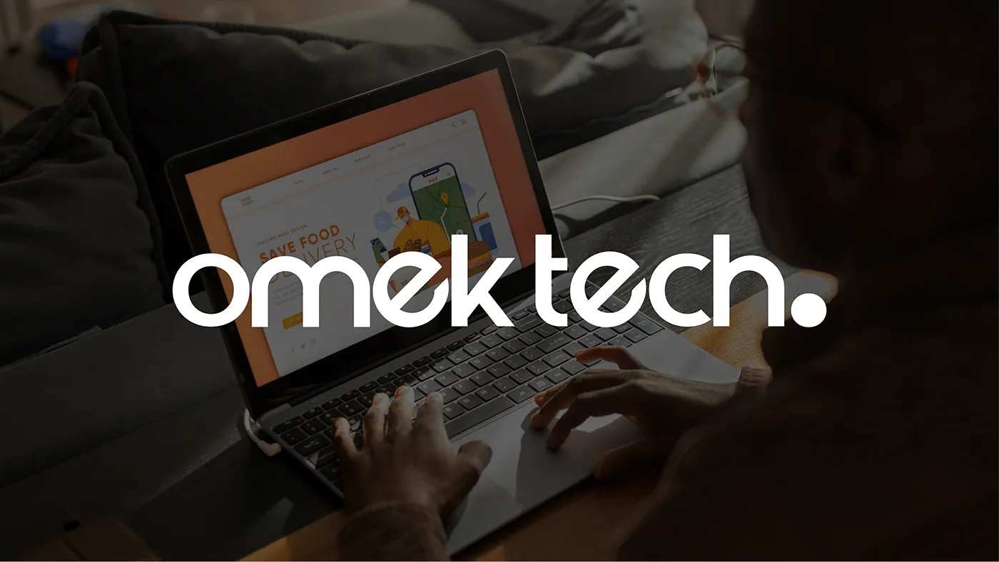
- Wordmark: Designed “omek tech.” in lowercase, rounded-terminal type with a full stop, friendly and approachable, but geometric enough to read as technical.
- Monogram: Built a compact “omt.” lock-up from the wordmark for use on tight spaces—favicons, social avatars, stamped collateral, where the full wordmark won’t fit.
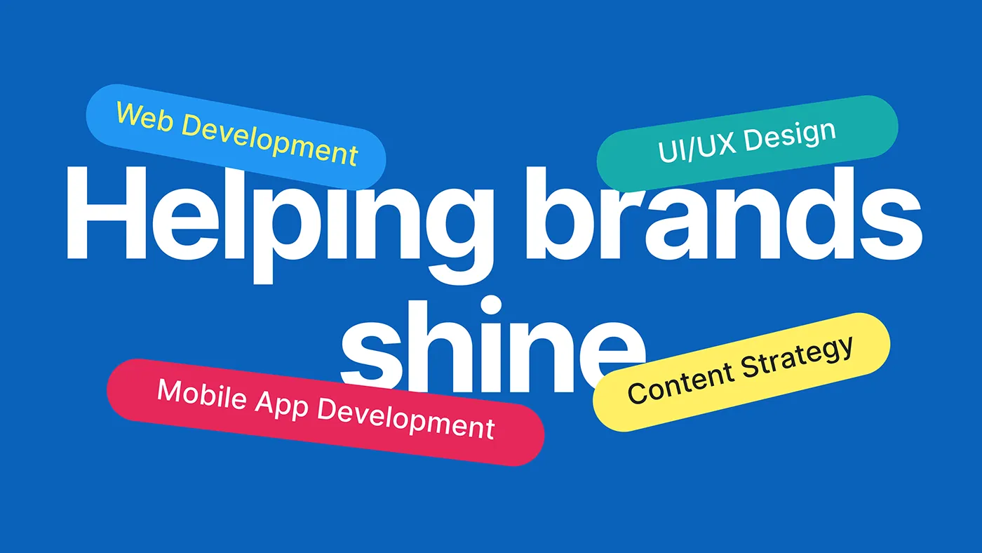
- Color system: Anchored the brand to a confident primary blue, with red, teal, and yellow used only as small accent tags to label each service (Web Development, UI/UX Design, Mobile App Development, Content Strategy) — keeping the palette structured rather than decorative.
- Messaging: Paired the identity with one clear brand line, “Helping brands shine”, used consistently across ads, social, and signage so the tagline does double duty as both message and design device.
- Collateral system: Extended the mark across real-world touchpoints—business cards, lanyards, tote bags, and notebook covers, to prove the identity holds up off-screen, not just on a website mockup.
The Solution
- Logo suite: Full “omek tech.” wordmark for primary use, “omt.” monogram for compact placements — both built from the same rounded geometric letterforms.
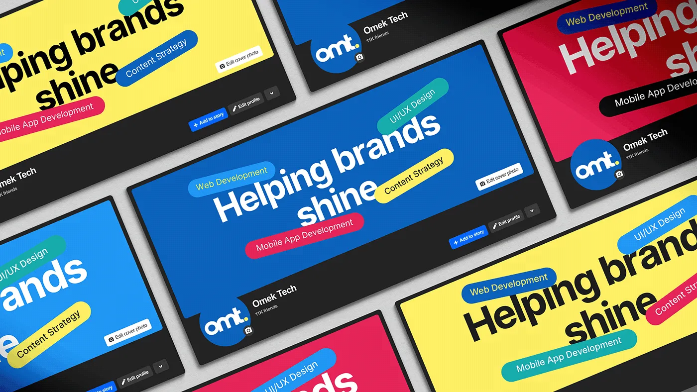
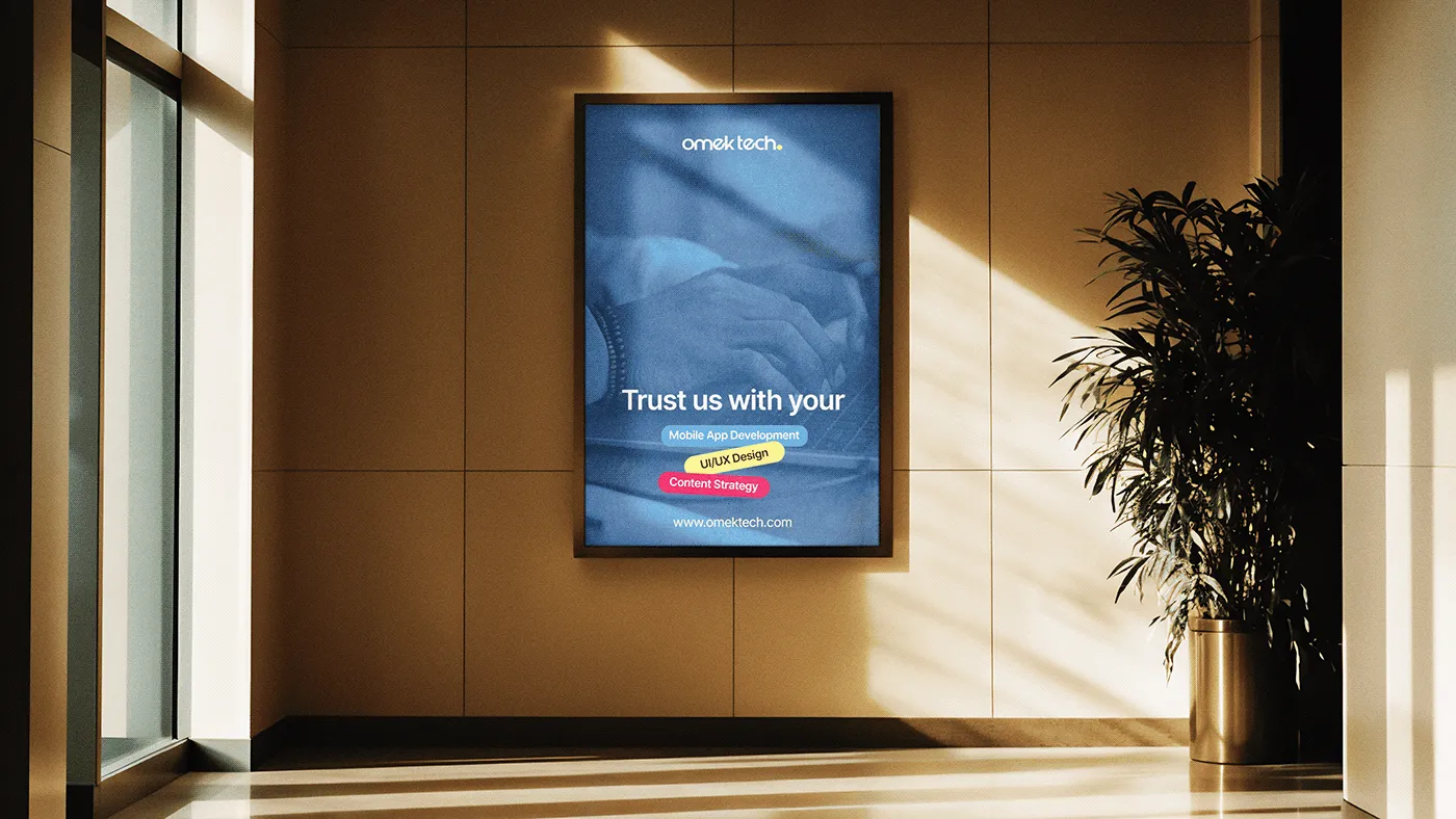
- Service tagging system: Each of the four services gets its own accent-color pill (blue, teal, red, yellow), used consistently across social banners and presentation slides so the offering is scannable at a glance.
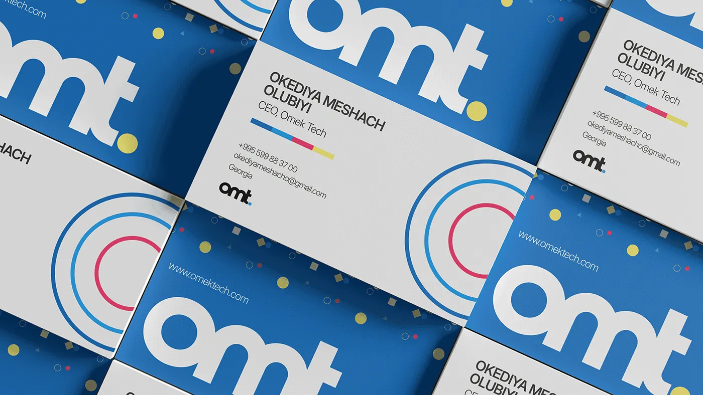
- Stationery: Business cards for CEO Okediya Meshach Olubiyi, using the blue field, monogram, and a colored bar device that echoes the service-tag system.
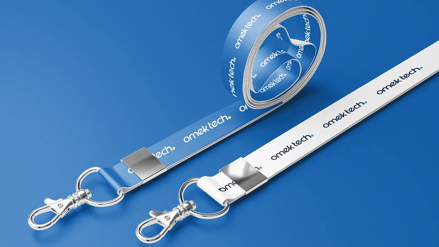
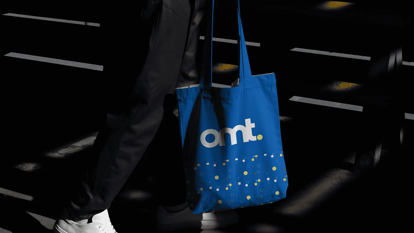
- Merch & collateral: Branded lanyards, tote bags, and notebook covers—consistent mark placement and a scattered confetti pattern used as a secondary brand texture on physical items.
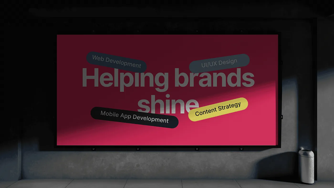
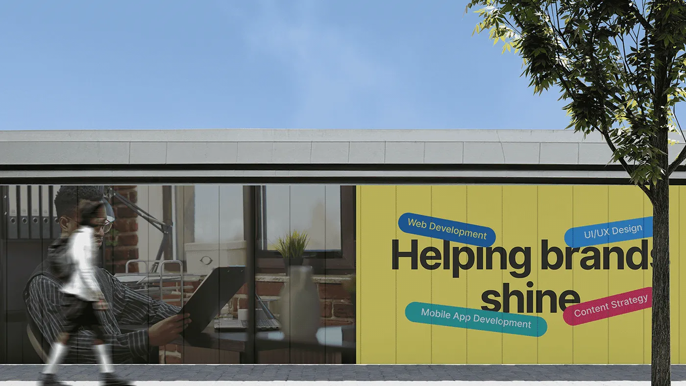
- Campaign: “Helping brands shine” billboard and social ad series, using the bold headline plus the four service pills as the core recurring layout.
The Outcome
A brand system that reads as digital-native without leaning on tech clichés — a rounded, friendly wordmark, a structured accent-color system that doubles as a service directory, and a collateral suite that carries the same energy from a business card to a billboard.
Client
Omek Tech
sector
Beauty/Cosmetics
country
Nigeria
Creative Director
Adesanmi Ayomide
Year
2024
Scope of work
Brand Identity · Packaging Design · Campaign Art Direction — Fictional/Concept Project
Building a premium identity for a natural skincare brand
Overview
Amona is a skincare brand built around one idea: skin care rooted in nature, but priced and presented like a premium product. Its audience is women in their mid-to-late 20s through their 30s who want visible results from ingredients they trust, and who are used to shopping in a market where “natural” often means “basic-looking.” Amona needed to look like neither — it needed to feel modern, feminine, and expensive, without losing the warmth of a body-and-skin-first brand.
The Challenge
- Tech agencies all look the same. Dark UI screenshots, generic sans-serif wordmarks, blue-on-white — the category default makes most dev agencies visually forgettable.
- Multiple services, one brand. Web development, mobile apps, UI/UX, and content strategy needed to feel like one coherent offering, not four separate departments.
- Corporate trust vs. modern energy. As a B2B agency pitching to business owners, Omek Tech needed enough polish to be trusted with a client’s brand while still feeling current enough to be credible at building digital products.
The Approach
- Wordmark: Designed “omek tech.” in lowercase, rounded-terminal type with a full stop, friendly and approachable, but geometric enough to read as technical.
- Monogram: Built a compact “omt.” lock-up from the wordmark for use on tight spaces—favicons, social avatars, stamped collateral, where the full wordmark won’t fit.
- Color system: Anchored the brand to a confident primary blue, with red, teal, and yellow used only as small accent tags to label each service (Web Development, UI/UX Design, Mobile App Development, Content Strategy) — keeping the palette structured rather than decorative.
- Messaging: Paired the identity with one clear brand line, “Helping brands shine”, used consistently across ads, social, and signage so the tagline does double duty as both message and design device.
- Collateral system: Extended the mark across real-world touchpoints—business cards, lanyards, tote bags, and notebook covers, to prove the identity holds up off-screen, not just on a website mockup.
The Solution
- Logo suite: Full “omek tech.” wordmark for primary use, “omt.” monogram for compact placements — both built from the same rounded geometric letterforms.
- Service tagging system: Each of the four services gets its own accent-color pill (blue, teal, red, yellow), used consistently across social banners and presentation slides so the offering is scannable at a glance.
- Stationery: Business cards for CEO Okediya Meshach Olubiyi, using the blue field, monogram, and a colored bar device that echoes the service-tag system.
- Merch & collateral: Branded lanyards, tote bags, and notebook covers—consistent mark placement and a scattered confetti pattern used as a secondary brand texture on physical items.
- Campaign: “Helping brands shine” billboard and social ad series, using the bold headline plus the four service pills as the core recurring layout.
The Outcome
A brand system that reads as digital-native without leaning on tech clichés — a rounded, friendly wordmark, a structured accent-color system that doubles as a service directory, and a collateral suite that carries the same energy from a business card to a billboard.