
Client
Leky Mills/Snacks
sector
Food
country
Nigeria
Creative Director
Adesanmi Ayomide
Year
2020-Till Date
Scope of work
Brand Identity · Packaging Design · Campaign Art Direction · Launch Campaign
Building a premium identity for a natural skincare brand
Overview
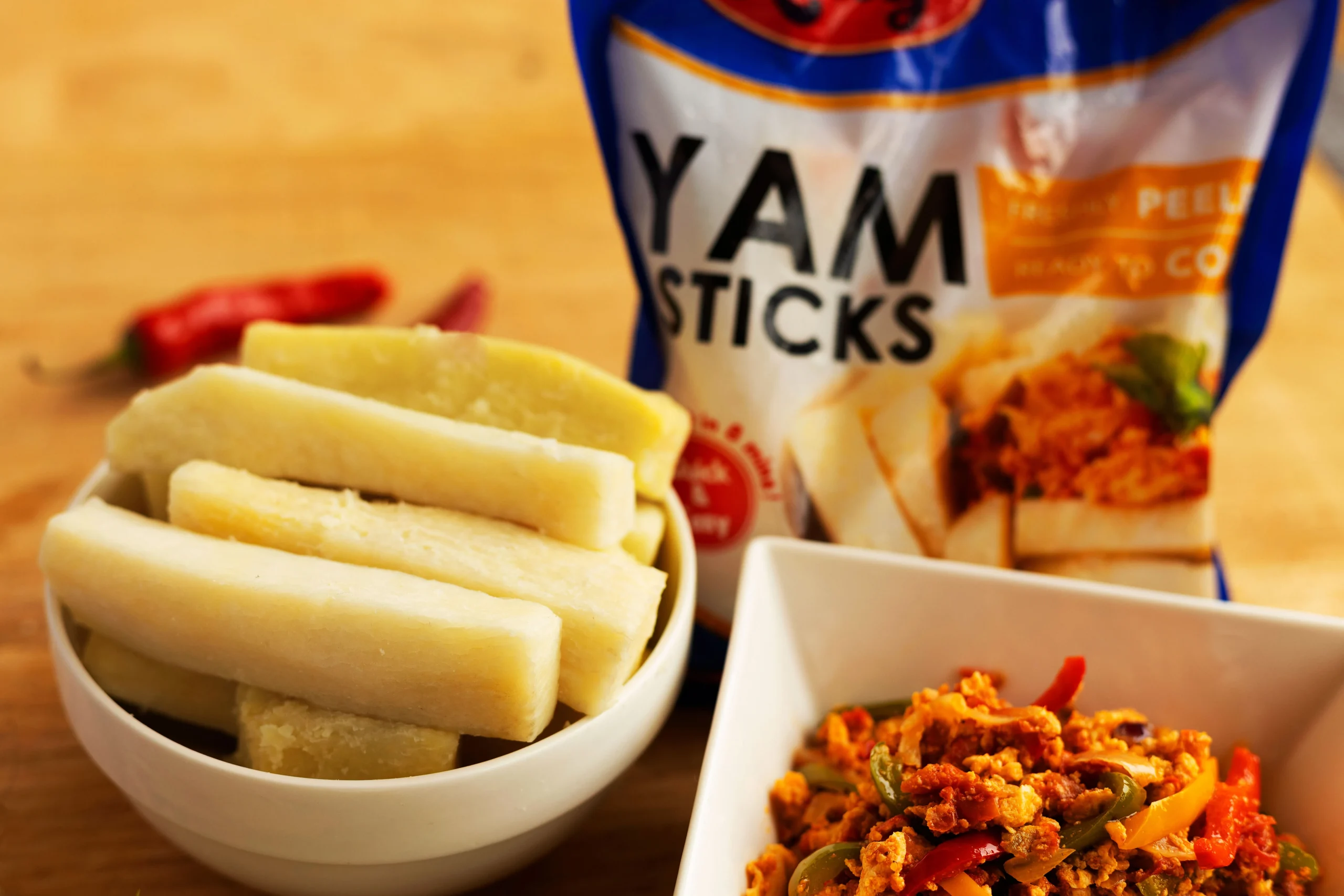
Leky Mills built its name on making yam — one of Nigeria’s most-eaten staples — quick and convenient through pre-cut yam sticks and fries. Yam Chips marked its next move: taking that same crop and turning it into a genuine snack-aisle product, a crispy, ready-to-eat chip that could sit next to potato chips on any shelf. The project covered packaging, launch campaign creative, and in-store retail display for the new Leky Snacks Co. line.
Scope: packaging design (Classic and Sweet Onion), digital launch campaign, and point-of-sale retail display.
The Challenge
- No category to borrow from. Potatoes have fries and chips as an established global category; yam doesn’t. The product needed packaging that read instantly as “chips” to a snack buyer, without a visual template already built for yam.
- Two product lines, one house of brands. Leky Mills already sells yam sticks and fries under the Leky name — the new chips needed their own shelf identity as “Leky Snacks Co.” while still being recognizably part of the same family.
- Proving a national first. The brand’s core claim — “First ever, best ever, our very own” — is a bold one. The campaign had to make Nigerian consumers feel proud ownership of the product, not just aware of it.
The Approach
- Positioned the sub-brand distinctly. Introduced “Leky Snacks Co.” as a named line under the parent Leky brand — same red oval logo and brand voice, but its own shelf identity separate from the yam sticks/fries range.
- Designed for instant chip recognition. Used the stand-up foil pouch format, bold flavor callouts, and a torn-chip hero shot — the same visual grammar shoppers already use to spot chips — so the product reads as “chips” before anyone processes that it’s made from yam.
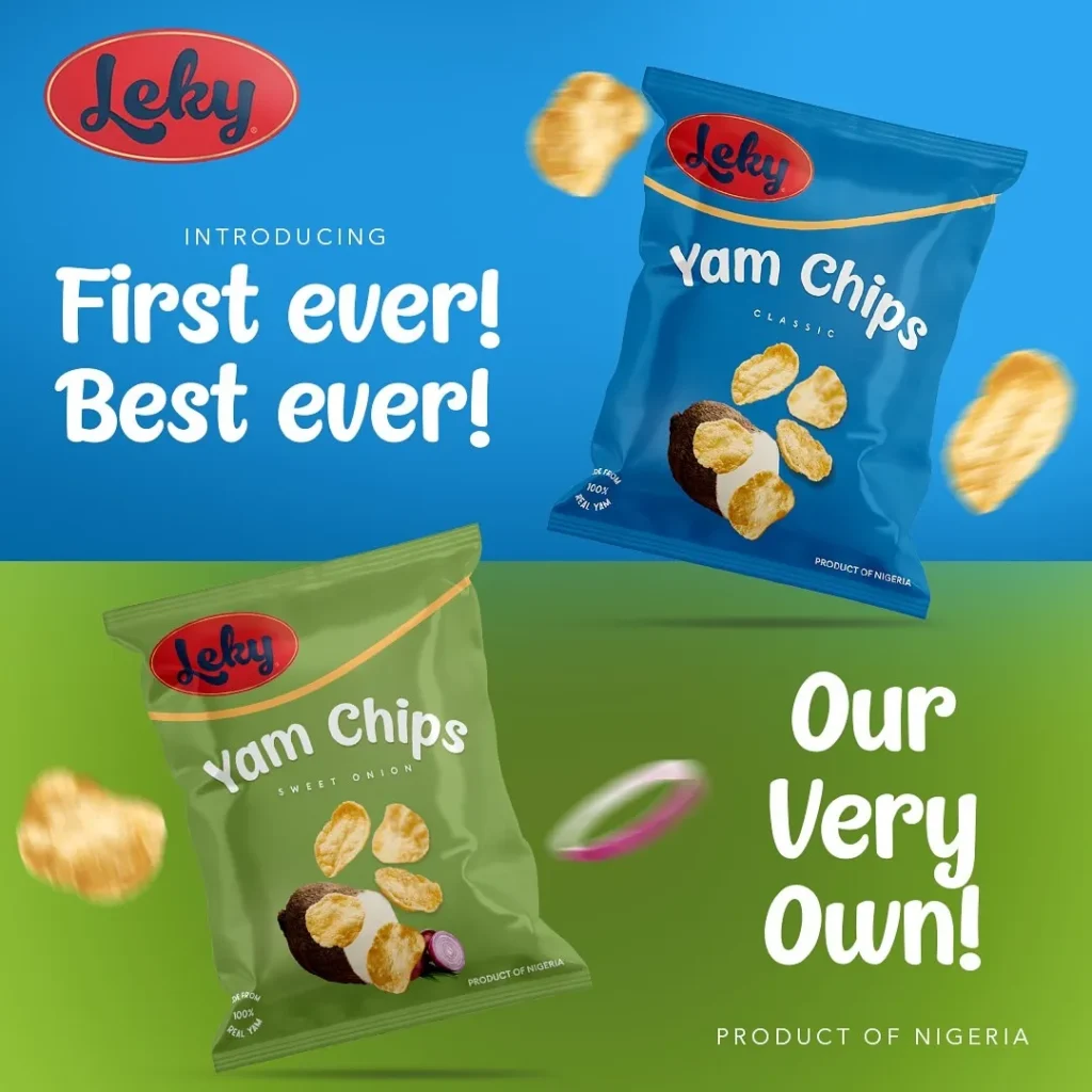
- Color-coded by flavor. Assigned green to Sweet Onion and blue to Classic, so the two variants are distinguishable across a shelf, a display stand, or a social feed at a glance.
- Kept the yam story visible. Anchored every pack with a whole yam tuber and the “Made from 100% real yam” callout, so the product’s local, natural origin stays part of the pitch — not hidden behind chip-category conventions.
- Built the campaign around national pride. Centered launch messaging on “First ever! Best ever! Our very own!” and “Product of Nigeria” — turning the product’s novelty into a source of pride rather than just a new-flavor announcement.
The Solution
- Packaging system — Two flavor-coded pouches (Classic in blue, Sweet Onion in green), consistent logo placement, and appetite-forward chip photography with a supporting yam-tuber shot.
- Launch campaign creative — Social and digital assets built around bold, oversized headline type (“First ever! Best ever!” “The Perfect Snacking Partner”) paired with dynamic, floating product shots.
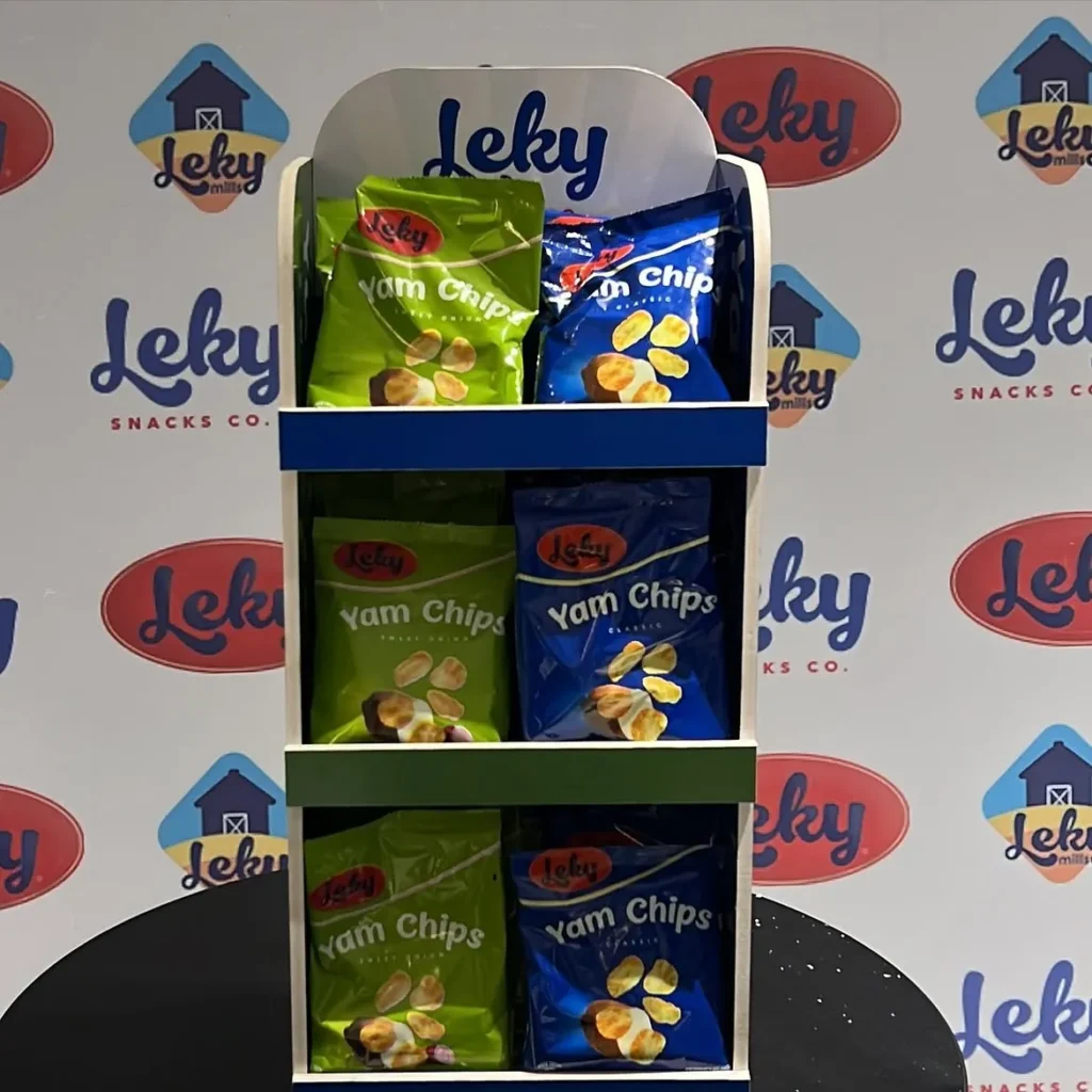
- Retail POS display—A branded tiered shelf stand for in-store placement, keeping both flavors visible and the Leky wordmark prominent at eye level.
The Outcome
A snack-aisle-ready identity for a product category that didn’t exist before it — packaging that speaks fluent “chips” while keeping its yam origin front and center, backed by a launch campaign built to make the product’s Nigerian-first status the headline.
Client
Leky Mills/Snacks
sector
Food
country
Nigeria
Creative Director
Adesanmi Ayomide
Year
2020-Till Date
Scope of work
Brand Identity · Packaging Design · Campaign Art Direction · Launch Campaign
Building a premium identity for a natural skincare brand
Overview
Leky Mills built its name on making yam — one of Nigeria’s most-eaten staples — quick and convenient through pre-cut yam sticks and fries. Yam Chips marked its next move: taking that same crop and turning it into a genuine snack-aisle product, a crispy, ready-to-eat chip that could sit next to potato chips on any shelf. The project covered packaging, launch campaign creative, and in-store retail display for the new Leky Snacks Co. line.
Scope: packaging design (Classic and Sweet Onion), digital launch campaign, and point-of-sale retail display.
The Challenge
- No category to borrow from. Potatoes have fries and chips as an established global category; yam doesn’t. The product needed packaging that read instantly as “chips” to a snack buyer, without a visual template already built for yam.
- Two product lines, one house of brands. Leky Mills already sells yam sticks and fries under the Leky name — the new chips needed their own shelf identity as “Leky Snacks Co.” while still being recognizably part of the same family.
- Proving a national first. The brand’s core claim — “First ever, best ever, our very own” — is a bold one. The campaign had to make Nigerian consumers feel proud ownership of the product, not just aware of it.
The Approach
- Positioned the sub-brand distinctly. Introduced “Leky Snacks Co.” as a named line under the parent Leky brand — same red oval logo and brand voice, but its own shelf identity separate from the yam sticks/fries range.
- Designed for instant chip recognition. Used the stand-up foil pouch format, bold flavor callouts, and a torn-chip hero shot — the same visual grammar shoppers already use to spot chips — so the product reads as “chips” before anyone processes that it’s made from yam.
- Color-coded by flavor. Assigned green to Sweet Onion and blue to Classic, so the two variants are distinguishable across a shelf, a display stand, or a social feed at a glance.
- Kept the yam story visible. Anchored every pack with a whole yam tuber and the “Made from 100% real yam” callout, so the product’s local, natural origin stays part of the pitch — not hidden behind chip-category conventions.
- Built the campaign around national pride. Centered launch messaging on “First ever! Best ever! Our very own!” and “Product of Nigeria” — turning the product’s novelty into a source of pride rather than just a new-flavor announcement.
The Solution
- Packaging system — Two flavor-coded pouches (Classic in blue, Sweet Onion in green), consistent logo placement, and appetite-forward chip photography with a supporting yam-tuber shot.
- Launch campaign creative — Social and digital assets built around bold, oversized headline type (“First ever! Best ever!” “The Perfect Snacking Partner”) paired with dynamic, floating product shots.
- Retail POS display—A branded tiered shelf stand for in-store placement, keeping both flavors visible and the Leky wordmark prominent at eye level.
The Outcome
A snack-aisle-ready identity for a product category that didn’t exist before it — packaging that speaks fluent “chips” while keeping its yam origin front and center, backed by a launch campaign built to make the product’s Nigerian-first status the headline.