
Client
Oyèláyò Pasta (Fictional Project)
sector
Food
country
Nigeria
Creative Director
Adesanmi Ayomide
Year
2025
Scope of work
Brand Identity · Packaging Design · Merchandise
Turning Nigerian street-food flavor into a pasta brand with its own visual language
Overview
Oyèláyò Pasta takes a familiar Italian staple and reimagines it through Nigerian street-food flavors — Jollof, Suya, Pepperoni, and more — sold as ready-to-eat trays. The brand needed an identity that felt unmistakably Nigerian at first glance, distinguished each flavor instantly on shelf, and still looked premium enough to hold its own in retail and out-of-home advertising.
Scope: logotype, color and pattern system, flavor-coded packaging, and branded merchandise.
The Challenge
- Say it right, on sight. “Oyèláyò” carries Yoruba tonal marks that change pronunciation and meaning — the wordmark had to preserve them without looking cluttered or like a typo to anyone unfamiliar with the language.
- One brand, many flavors. With multiple pasta variants (Jollof, Suya, Pepperoni, Láyó, and more), each pack needed to be instantly distinguishable at a glance while still reading as the same brand.
- Local flavor, retail-ready look. The product’s whole appeal is its Nigerian identity, the branding had to lean into that authentically, without tipping into a dated or informal “local food” look.
The Approach
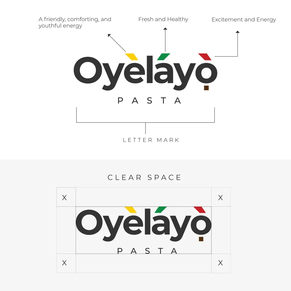
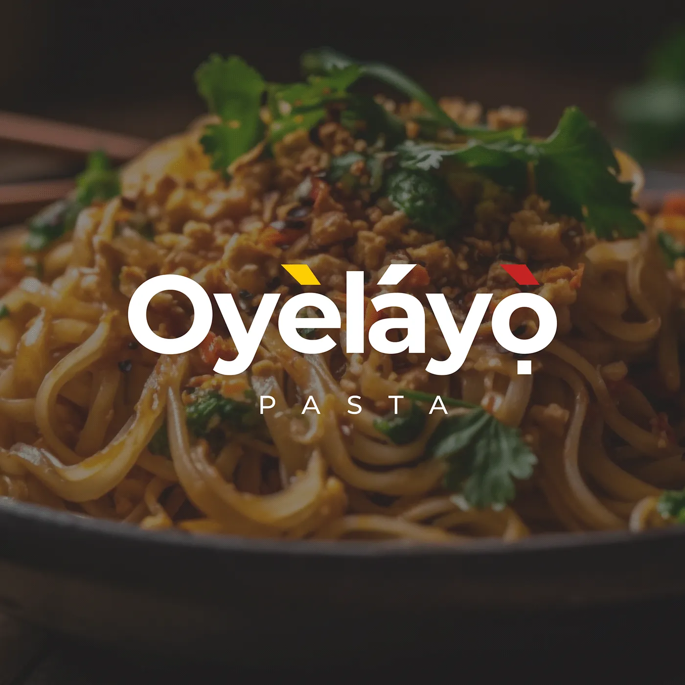
- Wordmark & diacritics: Kept the full Yoruba tonal marks on “Oyèláyò,” but redrew them as three small colored flags (yellow, green, red) sitting above the letters—turning a linguistic necessity into the brand’s signature visual detail.
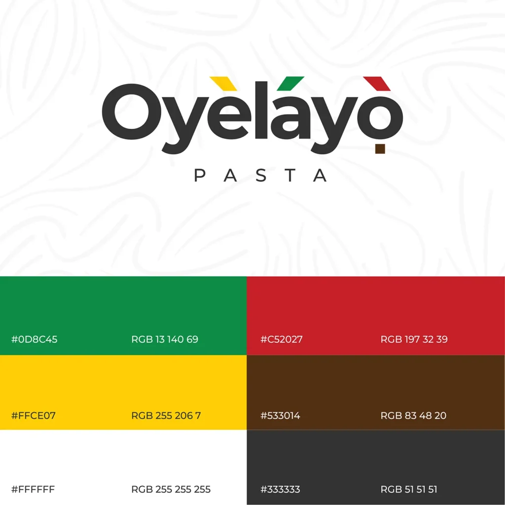
- Color system: Built the palette around the diacritic colors — green, red, yellow — plus a grounding brown, giving the brand a distinctly Nigerian, flag-adjacent palette without literally copying the flag.
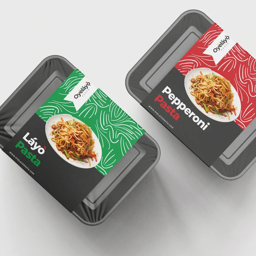
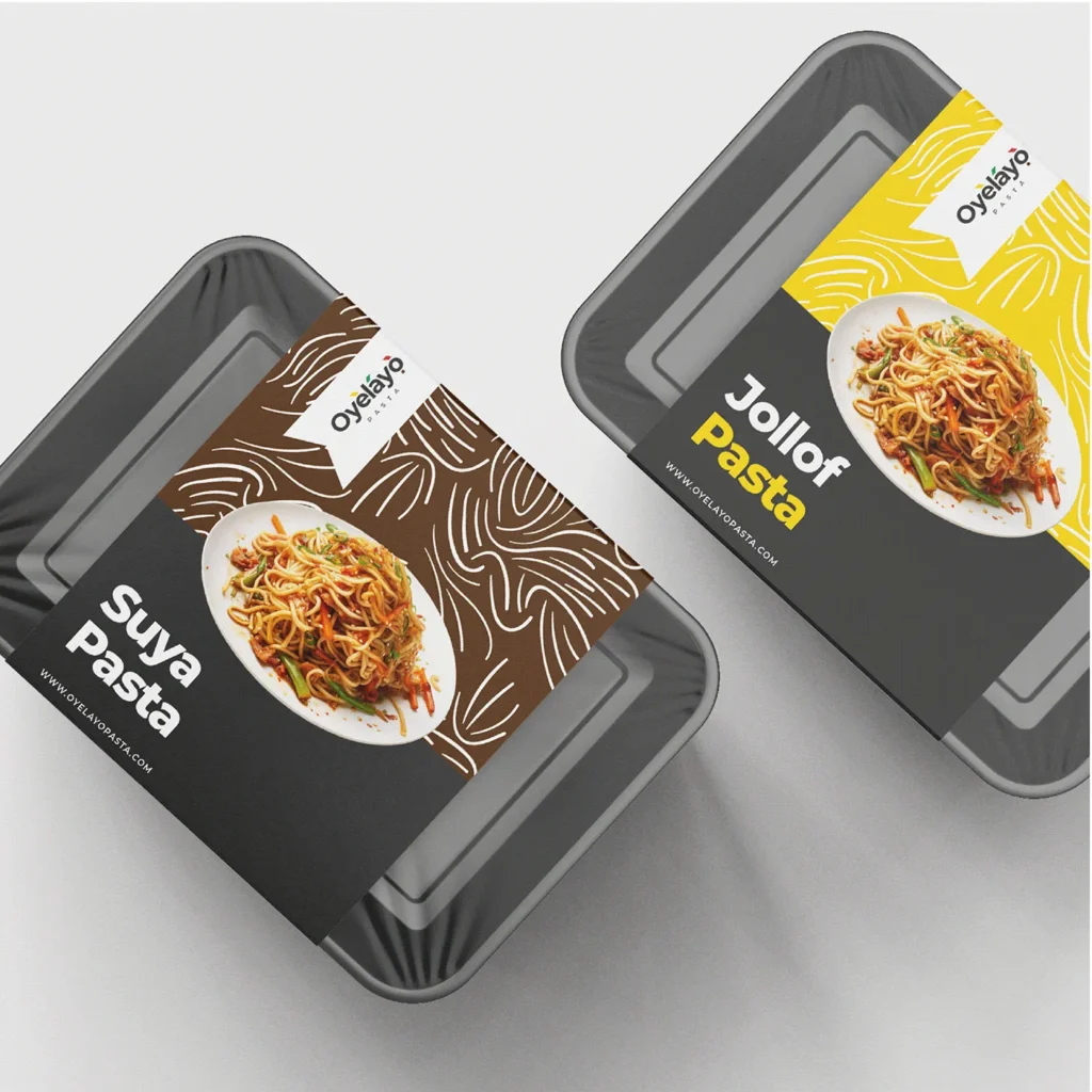
- Flavor coding: Assigned each palette color to a specific flavor line (green for Láyó, yellow for Jollof, brown for Suya, red for Pepperoni), so packaging color alone tells the customer what’s inside before they read a word.
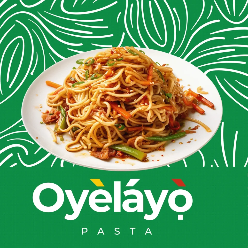
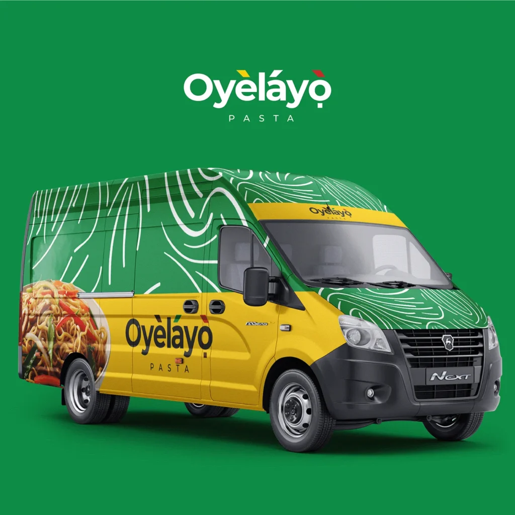
- Pattern system: Designed a recurring hand-drawn noodle-swirl line pattern as a background texture — ties every touchpoint back to the product itself and gives the brand a warmer, more tactile feel than a flat color block would.
- Photography: Centered every pack and ad on a single, appetite-forward plated shot of the pasta, keeping the food itself as the hero across all formats.
The Solution
- Logo suite: Full “Oyèláyò Pasta” lockup in dark, white, and full-color versions, built to sit cleanly on any of the four brand colors.
- Packaging: Flavor-specific tray labels—Jollof Pasta, Suya Pasta, Láyó Pasta, Pepperoni Pasta—sharing one layout template (logo flag, pattern field, product shot, flavor name) but color-coded per flavor for instant shelf recognition.
- Out-of-home: Billboard and social ad (“Layocious Pasta, Premium Taste”) using the green pattern background and a confident, appetite-led close-up shot.
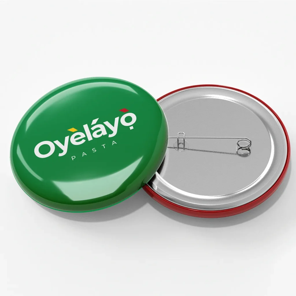
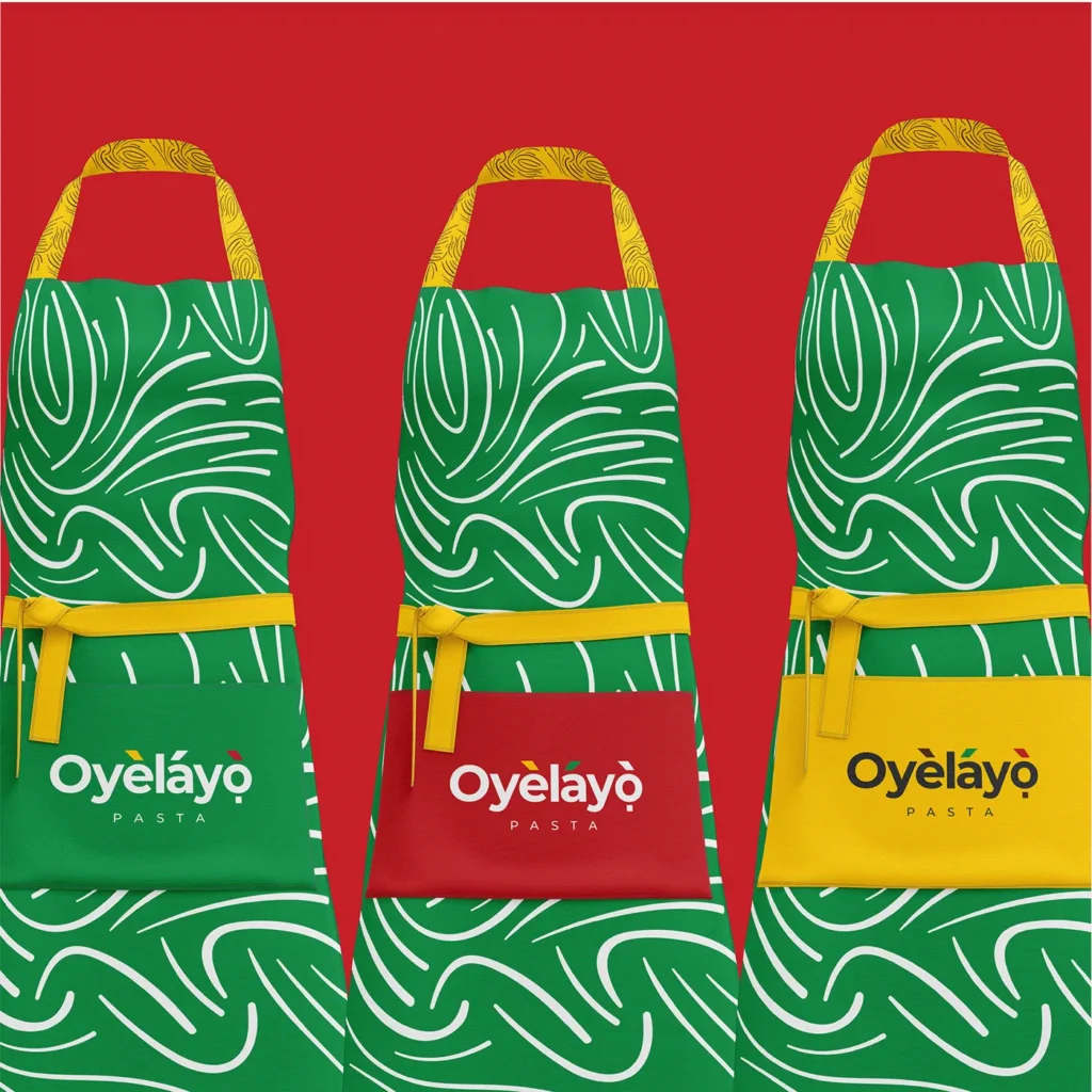
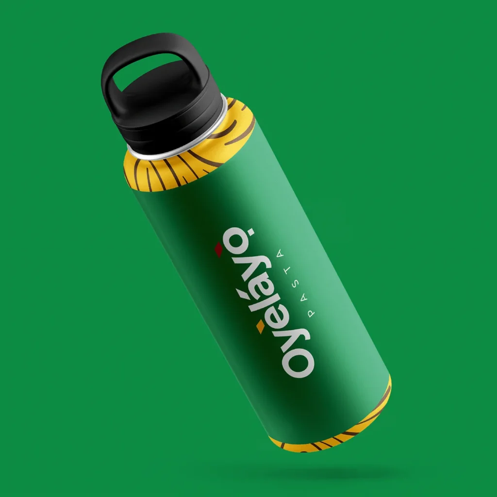
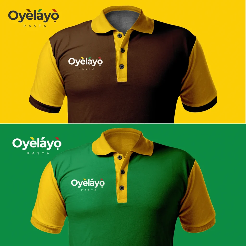
- Merchandise: Branded apparel (polo shirts), caps, water bottles, pin badges, and an apron—extending the pattern and color system into staff and promotional wear.
The Outcome
A food brand where the identity does double duty: the tonal-mark flags make the name easy to say correctly, and that same color system makes each flavor easy to find on shelf — all wrapped in a look that feels proudly Nigerian without reading as anything less than retail-ready.
Client
Oyèláyò Pasta (Fictional Project)
sector
Food
country
Nigeria
Creative Director
Adesanmi Ayomide
Year
2025
Scope of work
Brand Identity · Packaging Design · Merchandise
Turning Nigerian street-food flavor into a pasta brand with its own visual language
Overview
Oyèláyò Pasta takes a familiar Italian staple and reimagines it through Nigerian street-food flavors — Jollof, Suya, Pepperoni, and more — sold as ready-to-eat trays. The brand needed an identity that felt unmistakably Nigerian at first glance, distinguished each flavor instantly on shelf, and still looked premium enough to hold its own in retail and out-of-home advertising.
Scope: logotype, color and pattern system, flavor-coded packaging, and branded merchandise.
The Challenge
- Say it right, on sight. “Oyèláyò” carries Yoruba tonal marks that change pronunciation and meaning — the wordmark had to preserve them without looking cluttered or like a typo to anyone unfamiliar with the language.
- One brand, many flavors. With multiple pasta variants (Jollof, Suya, Pepperoni, Láyó, and more), each pack needed to be instantly distinguishable at a glance while still reading as the same brand.
- Local flavor, retail-ready look. The product’s whole appeal is its Nigerian identity, the branding had to lean into that authentically, without tipping into a dated or informal “local food” look.
The Approach
- Wordmark & diacritics: Kept the full Yoruba tonal marks on “Oyèláyò,” but redrew them as three small colored flags (yellow, green, red) sitting above the letters—turning a linguistic necessity into the brand’s signature visual detail.
- Color system: Built the palette around the diacritic colors — green, red, yellow — plus a grounding brown, giving the brand a distinctly Nigerian, flag-adjacent palette without literally copying the flag.
- Flavor coding: Assigned each palette color to a specific flavor line (green for Láyó, yellow for Jollof, brown for Suya, red for Pepperoni), so packaging color alone tells the customer what’s inside before they read a word.
- Pattern system: Designed a recurring hand-drawn noodle-swirl line pattern as a background texture — ties every touchpoint back to the product itself and gives the brand a warmer, more tactile feel than a flat color block would.
- Photography: Centered every pack and ad on a single, appetite-forward plated shot of the pasta, keeping the food itself as the hero across all formats.
The Solution
- Logo suite: Full “Oyèláyò Pasta” lockup in dark, white, and full-color versions, built to sit cleanly on any of the four brand colors.
- Packaging: Flavor-specific tray labels—Jollof Pasta, Suya Pasta, Láyó Pasta, Pepperoni Pasta—sharing one layout template (logo flag, pattern field, product shot, flavor name) but color-coded per flavor for instant shelf recognition.
- Out-of-home: Billboard and social ad (“Layocious Pasta, Premium Taste”) using the green pattern background and a confident, appetite-led close-up shot.
- Merchandise: Branded apparel (polo shirts), caps, water bottles, pin badges, and an apron—extending the pattern and color system into staff and promotional wear.
The Outcome
A food brand where the identity does double duty: the tonal-mark flags make the name easy to say correctly, and that same color system makes each flavor easy to find on shelf — all wrapped in a look that feels proudly Nigerian without reading as anything less than retail-ready.