
Client
Amona Skincare (Fictional Project)
sector
Beauty/Cosmetics
country
Nigeria
Creative Director
Adesanmi Ayomide
Year
2024
Scope of work
Brand Identity · Packaging Design · Campaign Art Direction — Fictional/Concept Project
Building a premium identity for a natural skincare brand
Overview
Amona is a skincare brand built around one idea: skin care rooted in nature, but priced and presented like a premium product. Its audience is women in their mid-to-late 20s through their 30s who want visible results from ingredients they trust, and who are used to shopping in a market where “natural” often means “basic-looking.” Amona needed to look like neither — it needed to feel modern, feminine, and expensive, without losing the warmth of a body-and-skin-first brand.
The Challenge
- Category sameness. Most natural skincare brands use the same visual shorthand; earthy tones, leaf icons, kraft textures, making them easy to categorize but hard to remember.
- Price vs. perception gap. Amona sits above mass-market skincare. The identity had to signal that price before anyone reads the ingredient list.
- Photography-first brand. The brand’s message is empowerment through real skin — the identity had to support diverse, un-retouched skin tones, not compete with them.
The Approach
- Brand values: Anchored every decision to three filters: modern, feminine, natural-with-a-premium-feel.
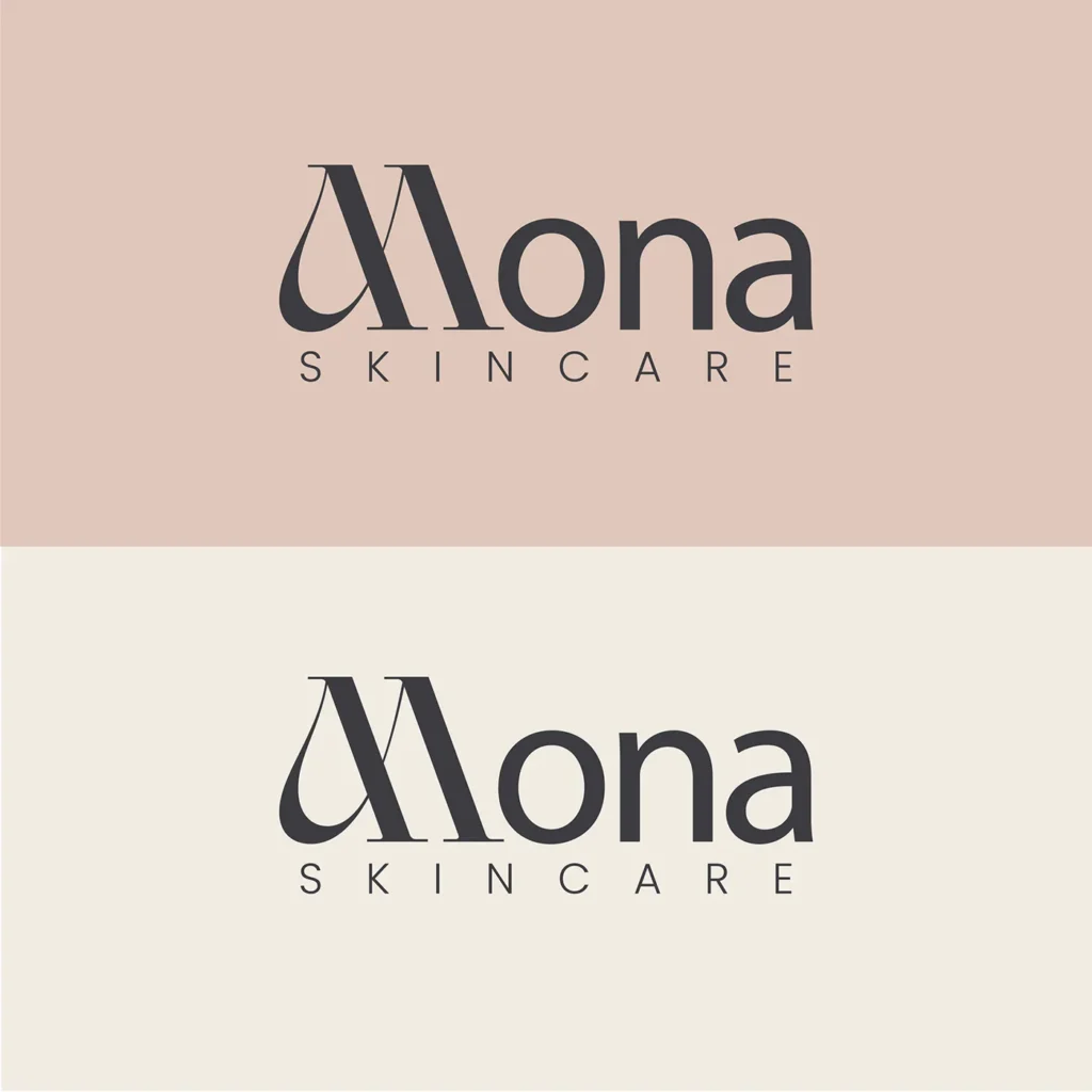
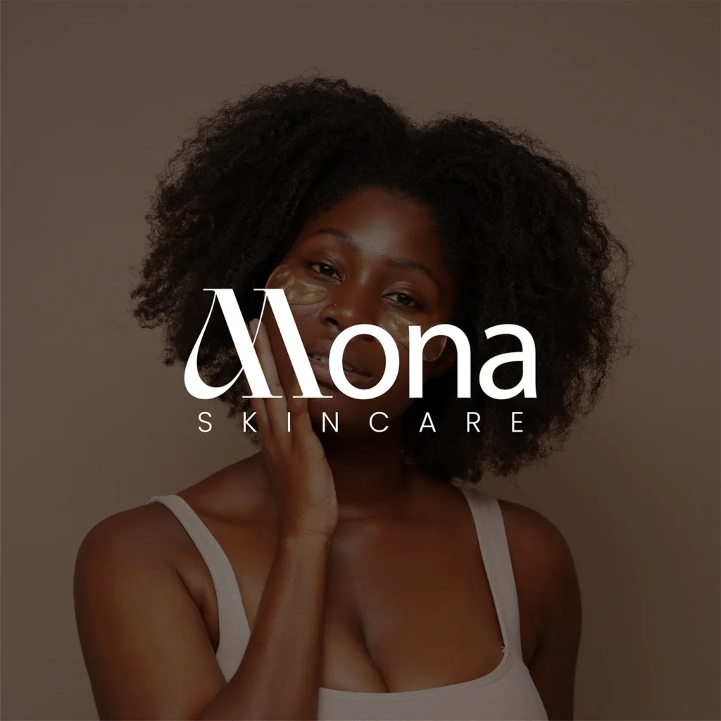
- Logotype: Built distinctiveness into the wordmark itself — a soft, looping ligature on the “M,” so no separate icon is needed. Works at poster scale and bottle scale alike.
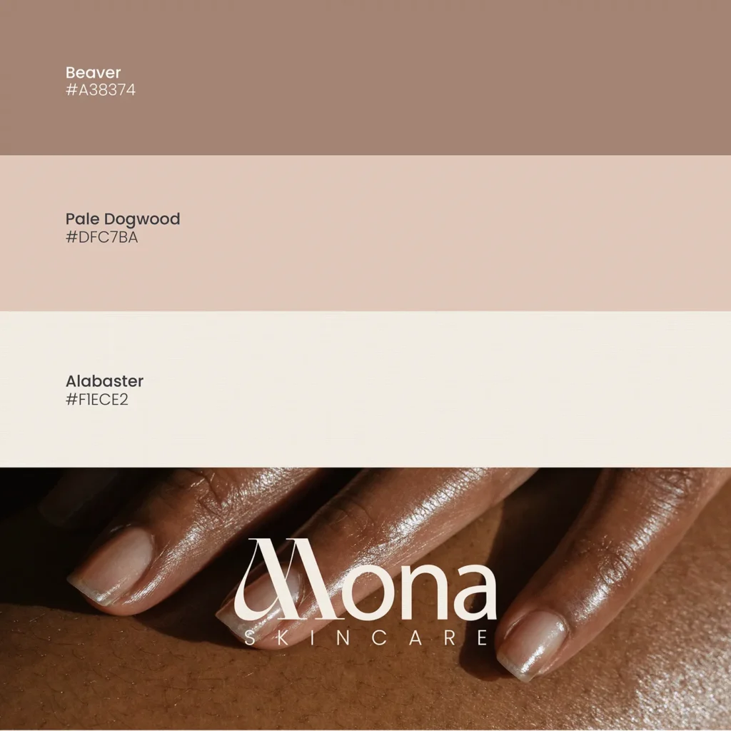
- Color palette: Kept to three warm, low-saturation tones (Beaver, Pale Dogwood, Alabaster) so the palette reads premium and calm, leaving skin tones in photography as the most vivid element on any page.
- Typography: Soft serif for the wordmark and hero moments (feminine, tactile); clean wide-tracked sans-serif for product names and functional copy (legible, modern).
- Imagery: Photography-led, not illustration-led — close, warm shots of real skin. Logo built to work in white on dark skin and in ink on light backgrounds.
The Solution
- Brand identity: Custom ligature wordmark, three-color palette, serif/sans pairing — flexible across packaging, and digital with no redesign needed.
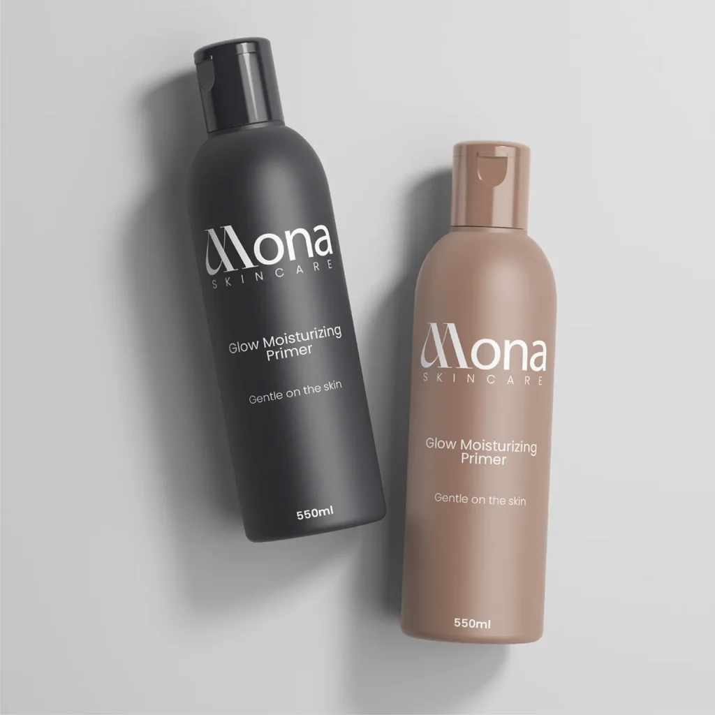
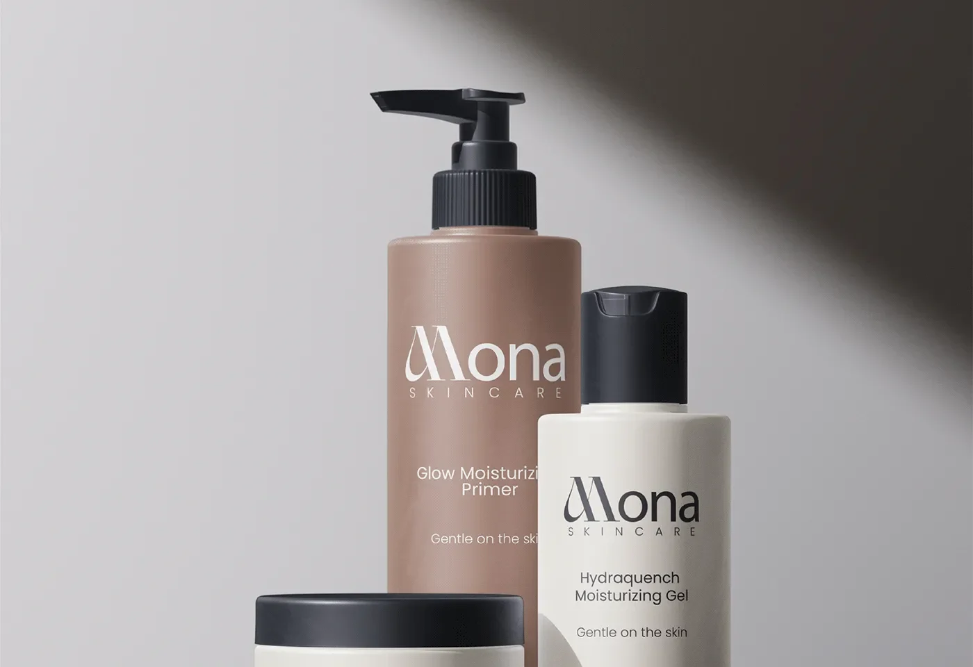
- Packaging: Three products (Glow Moisturizing Primer, Glow Moisturizing Gel, Hydraquench Moisturizing Gel) unified as one family via matte bottles/jars in black, taupe, and alabaster, consistent logo lockup, and a repeated “Gentle on the skin” line.
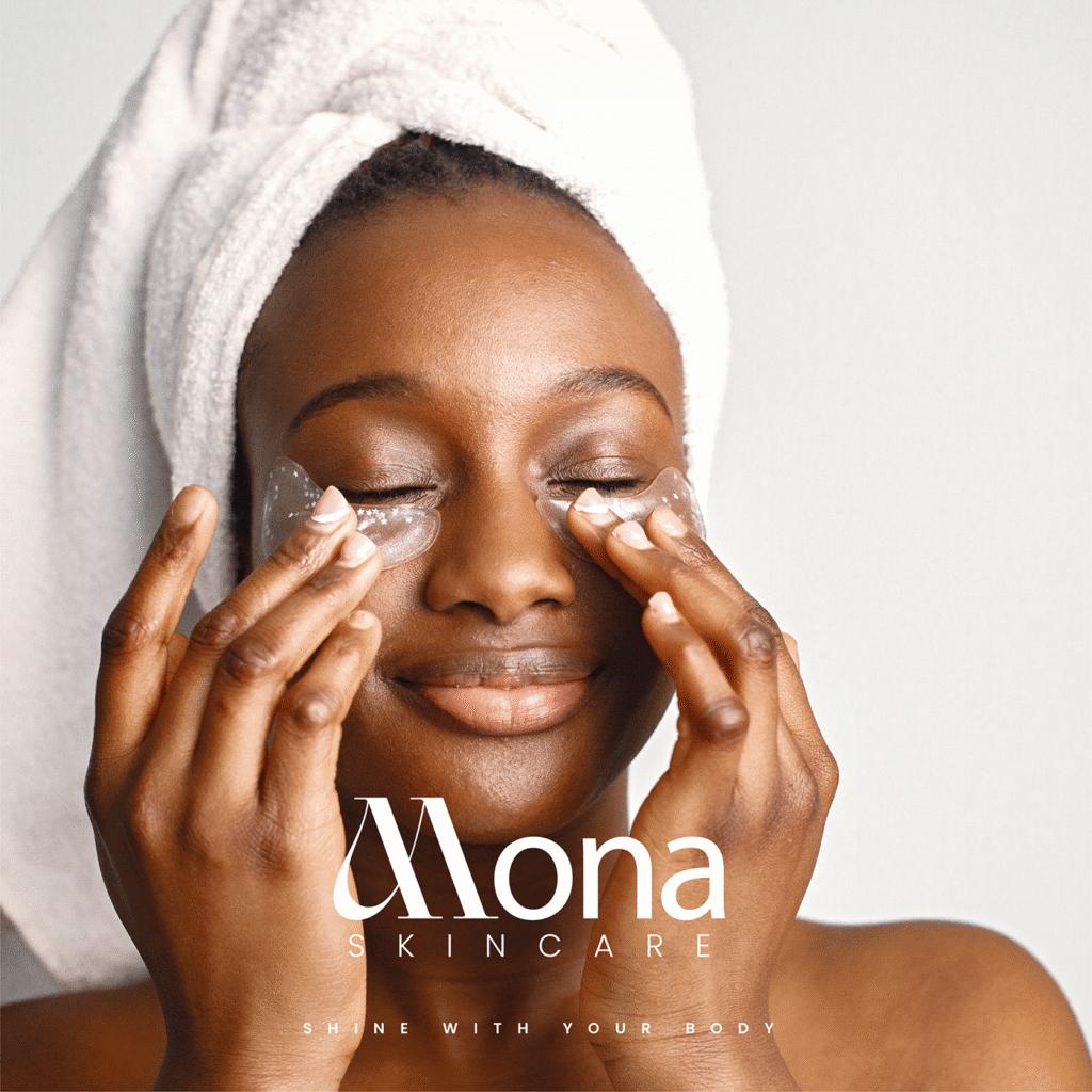
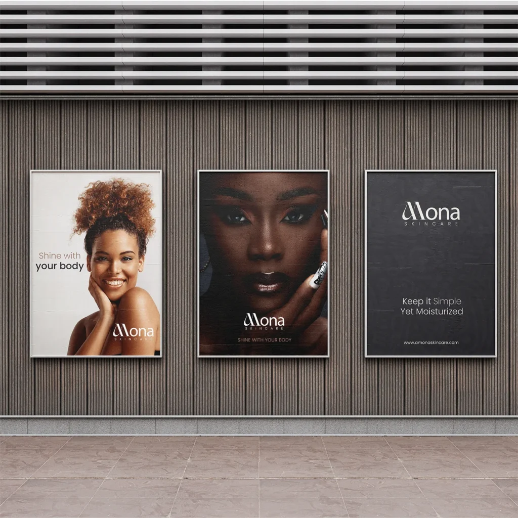
- Campaign: “Shine With Your Body” poster series — large-format, photography-led placements with short copy and a reversed white wordmark. Same core assets scale from bottle to billboard.
The Outcome
A skincare identity that earns its premium price through restraint, not decoration — trusting real skin and a confident wordmark to carry the brand in a category still leaning on leaf icons and kraft paper.
Amona Skincare is a fictional/concept brand project developed to explore premium natural-beauty positioning through identity, packaging, and campaign design.
Client
Amona Skincare (Fictional Project)
sector
Beauty/Cosmetics
country
Nigeria
Creative Director
Adesanmi Ayomide
Year
2024
Scope of work
Brand Identity · Packaging Design · Campaign Art Direction — Fictional/Concept Project
Building a premium identity for a natural skincare brand
Overview
Amona is a skincare brand built around one idea: skin care rooted in nature, but priced and presented like a premium product. Its audience is women in their mid-to-late 20s through their 30s who want visible results from ingredients they trust, and who are used to shopping in a market where “natural” often means “basic-looking.” Amona needed to look like neither — it needed to feel modern, feminine, and expensive, without losing the warmth of a body-and-skin-first brand.
The Challenge
- Category sameness. Most natural skincare brands use the same visual shorthand; earthy tones, leaf icons, kraft textures, making them easy to categorize but hard to remember.
- Price vs. perception gap. Amona sits above mass-market skincare. The identity had to signal that price before anyone reads the ingredient list.
- Photography-first brand. The brand’s message is empowerment through real skin — the identity had to support diverse, un-retouched skin tones, not compete with them.
The Approach
- Brand values: Anchored every decision to three filters: modern, feminine, natural-with-a-premium-feel.
- Logotype: Built distinctiveness into the wordmark itself — a soft, looping ligature on the “M,” so no separate icon is needed. Works at poster scale and bottle scale alike.
- Color palette: Kept to three warm, low-saturation tones (Beaver, Pale Dogwood, Alabaster) so the palette reads premium and calm, leaving skin tones in photography as the most vivid element on any page.
- Typography: Soft serif for the wordmark and hero moments (feminine, tactile); clean wide-tracked sans-serif for product names and functional copy (legible, modern).
- Imagery: Photography-led, not illustration-led — close, warm shots of real skin. Logo built to work in white on dark skin and in ink on light backgrounds.
The Solution
- Brand identity: Custom ligature wordmark, three-color palette, serif/sans pairing — flexible across packaging, and digital with no redesign needed.
- Packaging: Three products (Glow Moisturizing Primer, Glow Moisturizing Gel, Hydraquench Moisturizing Gel) unified as one family via matte bottles/jars in black, taupe, and alabaster, consistent logo lockup, and a repeated “Gentle on the skin” line.
- Campaign: “Shine With Your Body” poster series — large-format, photography-led placements with short copy and a reversed white wordmark. Same core assets scale from bottle to billboard.
The Outcome
A skincare identity that earns its premium price through restraint, not decoration — trusting real skin and a confident wordmark to carry the brand in a category still leaning on leaf icons and kraft paper.
Amona Skincare is a fictional/concept brand project developed to explore premium natural-beauty positioning through identity, packaging, and campaign design.